2024 · DATA ENGINEERING | PIPELINE
NBA Analytics Dashboard
A player stats pipeline for the 2025-26 season: nightly ingestion from the NBA Stats API, dbt transforms, and a Plotly Dash dashboard with 5 interactive filters.
Tech Stack
Overview
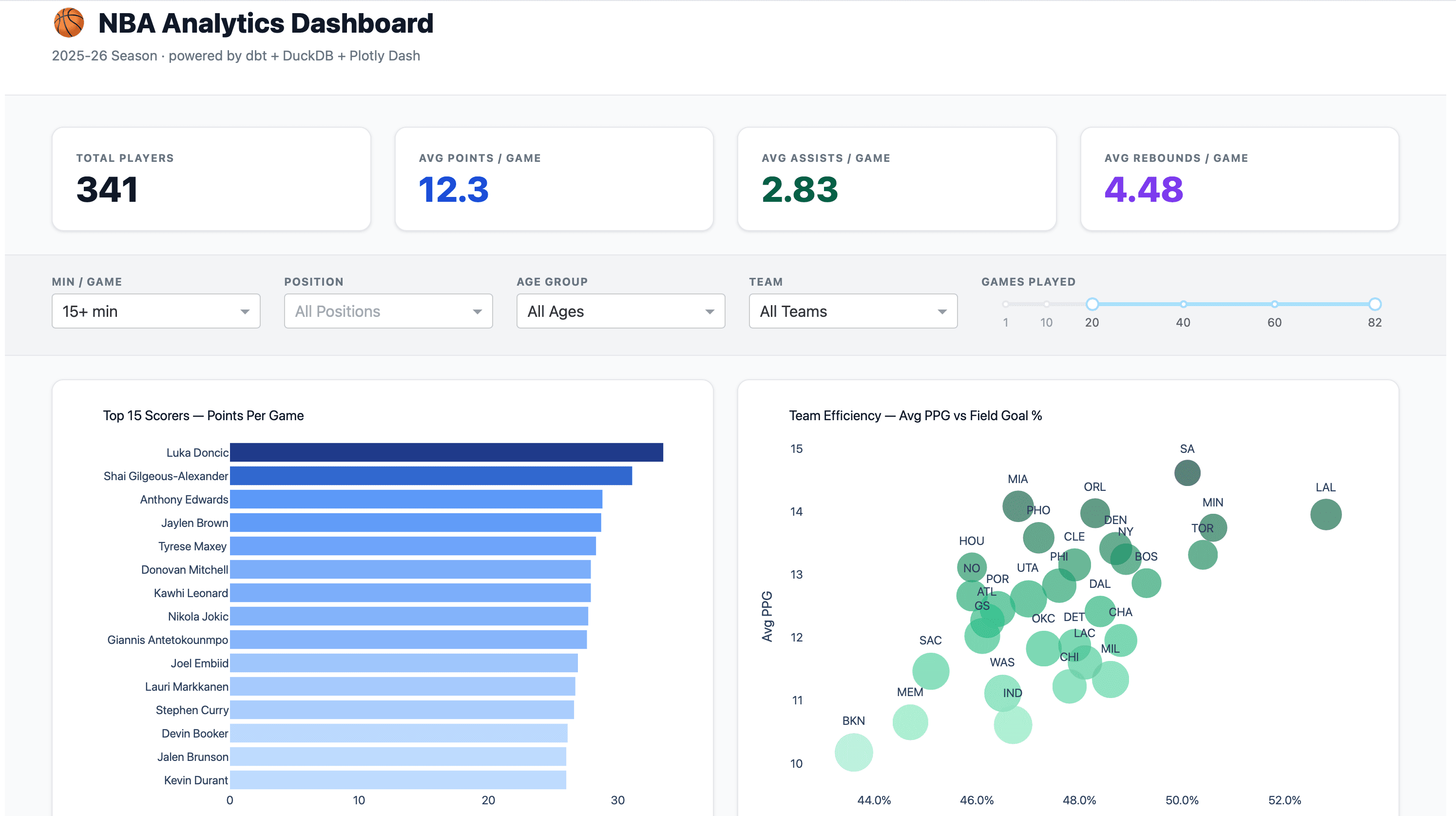
Built around a question I kept coming back to: which players are actually useful, not just efficient? The pipeline pulls 500+ player records nightly, runs them through dbt models with 7 quality tests, and serves them in a dashboard filterable by position, age, minutes, team, and games played. The Impact Score leaderboard combines PPG, APG, RPG, and +/- into a single composite, a more honest answer than any individual stat.
What I Built
- 529+ NBA players tracked across the 2025-26 season
- 5 interactive filters: Minutes, Position, Age, Team, Games Played
- Top 15 Scorers visualization with blue gradient bars
- Team Efficiency scatter: PPG vs FG%, bubble-sized by roster depth
- Impact Score leaderboard: weighted composite of PPG, APG, RPG, +/-
- 7 dbt data quality tests, all passing
- Nightly data refresh from NBA Stats API with graceful fallback
- Technical architecture page with pipeline diagrams
Screenshots
Dashboard Overview

Filter Controls
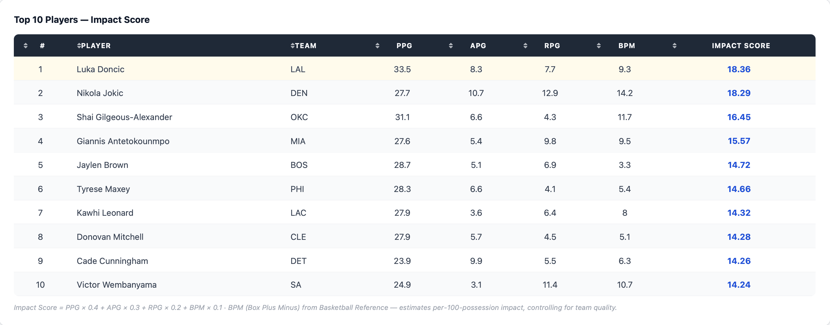
Impact Score Leaderboard
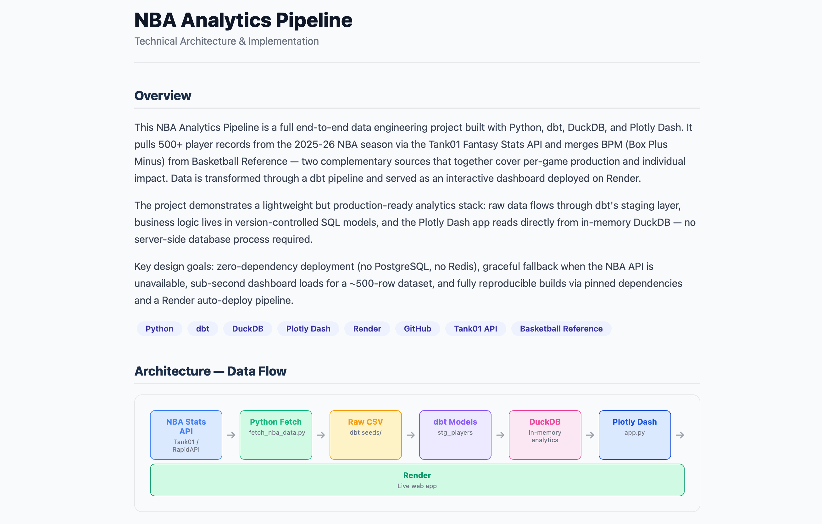
Technical Architecture
What I Learned
stats.nba.com blocks non-browser traffic, so I built a graceful fallback to a sample dataset
dbt + protobuf version conflicts: pinned to protobuf==4.25.9 for stable builds
pandas==2.1.4 + Python 3.11 required for Render deployment (3.14 incompatible)
Context-managed DuckDB connections prevent resource leaks in production
Plotly Dash styling requires inline styles, since Tailwind CDN classes don't apply without a build step
dcc.RangeSlider is better UX than dropdown for continuous numeric filters like Games Played